I decided to experiment with this image and see how effective it would be as a front cover. I still wanted to keep with my idea of 'dimensions'.

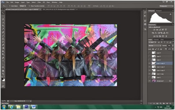
I made a copy of the image and removed the graffiti in the background so I was left with an image of Gabi's body.

I then lowered the opacity of this image so that when it is shown alongside the main image it will be fainter and create the 'dimension' effect.

I added more duplicates and lowered the opacity of the duplicated images depending on how far out it was from the main image of Gabi. The multiple images of Gabi help to amplify the 'dimension' effect.
I then added text to the album cover.

I then repositioned the text to where I thought it looked good. And I added a 'Parental Advisory Explicit Content' logo as well as modifying the brightness and contrast of the image.

This is what I ended up with. I did like my design but after some discussion with my peers I concluded that the page was too busy; with the bright colours and multiple images it was just a lot to look at and not an effective front cover. Furthermore, the image that I used did not show her face which was too unconventional and so I decided that this image will be better on the inside of my digipak rather than on the front cover.
No comments:
Post a Comment