Thursday 16 April 2015
Tuesday 14 April 2015

Friday 10 April 2015
Thursday 9 April 2015
Tuesday 31 March 2015
Final Music Video
This is my final music video. I am really pleased with the way it turned out. I think we have successfully incorporated elements of Deep House and Urban effectively. We stuck to the initial ideas from the animatic as well as coming up with new ideas throughout the course of the project. The music video sticks to the typical conventions and would definitely appeal to it's target audience.
Saturday 28 March 2015


Friday 27 March 2015
Website - Tour Page

I also added some festivals at the bottom of the page; these are the typical festivals that an artist like Tomi would perform at because it is the type of festival her target demographic would attend. I also linked the images to their relevant home pages.

Website - Photos Page

This is the photos page for my website, it was inspired by the photos page on the Disclosure website. I really like it because I feel it is very modern and edgy and so it will appeal to my target audience. The layout has many resemblances to Instagram and Tumblr pages; I thought this made it more suitable for my audience as those are the type of social media platforms my audience will use regularly and so they will be familiar with the interface.
Thursday 26 March 2015
Website - Social Media Page
Social media is a very important element featured on websites; it provides the opportunity for fans to get to know the artist more and build a deeper relationship. Below are the different examples of social media I have incorporate.


Facebook:
Twitter:
Soundcloud:
YouTube:
Instagram:
Website - Store Page
The images below are the merchandise I created to use on my website. A really important part of promoting an artist is having good merchandise that fans will enjoy buying whilst also increasing the status of an artist. I found plain images online and I edited them using Photoshop. To most of the products I simply added the artist name 'Tomi'; I kept it simple due to the fact the target audience will be teenagers and above so it had to be 'cool' and 'modern'. However, I did add an image of Tomi's face to the white t-shirt due to the possibility some fans may want this.


Initial Website Sketches/Ideas
After conducting my website research I set about trying to visualise the design for my website. The images below are a rough idea of what my pages may look like.

This is the design for my home page. I will have the artist name 'Tomi' at the top of the page and next to it will be the links to the other pages and the social networking sites. The header will remain the same across every page. I am still deciding on whether to use a have a background colour or use an image. The boxes below the header will consist of images; when the user clicks on the image it will direct them to the page relevant to the image, for example, if one of the images is the album cover it will direct the user to the 'Music' page. The images below are a rough outline as to what the other pages will look like and their general layout.


Wednesday 25 March 2015
Website Research - Ella Eyre
Content:
- Home Page
- Updates Page - consists of recent events, performances, single releases
- My Life Page - consists of images from Ella's Instagram page
- Watch Page - has a link to her YouTube/Vevo account. Consists of her music videos, performances, interviews and behind the scenes footage.
- Listen - has a link to Soundcloud. Consists of sound files of her songs, covers, interviews and DJ remixes.
- Shows - consists of her tour dates and performances with links to 'Songkick' which is an online ticket purchasing website.
- Shop - consists of merchandise that fans can buy
- Sign-up for free download - fans can sign up and receive a song for free.
Purpose:
'A Pretty Good Website' create and maintain Ella's website but the content is provided by Ella herself (e.g. instagram images) and her record label Virgin EMI Records. As Ella is relatively new on the music scene she is still trying to create a loyal fan base and is still developing her star image; for this reason the record label will aim to include close-ups of Ella wherever possible. This is done to get the viewer more familiar with Ella and increase her recognisability. As Ella is quite young they will use images that portray her in a fun, happy, quirky light but still present her as a normal person. Due to her age, her target audience will be people 14-24 years of age; therefore she will be presented in a way that people can identify with and relate to. As she is yet to receive idol status she won't be presented in the same way as Beyonce per say who is viewed as being greater than human. The key emphasis of this website is promotion, not only of her music, or her merchandise but her face and her star image, as that is what draws the initial attention of the viewer.
Information:
The website is updated daily with new images and videos from Ella's Instagram. But also new videos are added from interviews or from performances. As Ella is a new artist she doesn't have the luxury of maintaining a private life; the way to increasing her fan base is to let them into every aspect of her life; that is why it is really important that her website is up-to-date as the events that happen in her life draw attention to her, that attention is then transferred onto her music. The tour page is also updated as they are released.
Music:
Her fans have access to all her YouTube videos and any interviews or extra videos she might have, which are all available to view for free. By signing up the fan also gets a free song, this is good incentive to please existing fans and encourages other people to listen to her songs. There is also an array of sound files available on her 'Listen' page, this is important as a potential fan may want to get a better scope of Ella's musical abilities before investing in her album. Unlike other established artists, it is important for Ella to give out some of her music for free as that is the only way people will listen to her music, as no one will pay for a single/album on the off chance they might like it.
Style:
There are a vast number of images used throughout the website, and a header with an image of her and her is visible on every page, this is done to increase the memorability of the artist. The layout is very modern and has a 'instagram' feel to it. This appeals to a younger generation who are more technologically saavy and so they will feel more comfortable using the website as the layout is so familiar to them. There is a main navigation bar underneath the header; all the links are clearly visible. The main colours used are white and red however, as images take up a large proportion of the website essentially it is filled with many different colours. Pictures aside, the colours used a quite simple and regal which match the 'Royal' script used to display her name.
Navigation:
Navigating around this website is made very simple due to the navigation bar found underneath the header. It has links to all the relevant pages and the 'Shop' link opens in a new tab so the user can purchase any merchandise and continue browsing the website from where they left off.
Overall, I think it is a very effective website. It tries to promote Ella from every angle and introduce her as a new artist. I like the use of images as projecting the star image is very important with new artists and I will incorporate this into my ancillary task. I also like the idea of the header, I think it is more engaging than just a name at the top of a screen and so I will also try and incorporate this.
Tuesday 24 March 2015
Website Research - Disclosure
Content:
- Home Page - consists of images, each of which are links to the different sections of the website. This is dependent on the picture for example, the image of the album is a link to the 'Music' page.
- Blog Page - consists of a timeline of the boys activities that are aided with images.
- Music Page - consists of the songs that were publicly released that the fans can listen to for free.
- Photos Page - consists of photos of the Disclosure boys that are either taken of them in their private lives, or photos from performances or promotional photos.
- Live Page - consists of the different events and venues Diclosure are going to perform in. Also has a link to Ticketmaster so that fans can purchase tickets.
- Store Page - consists of merchandise fans can buy ranging from albums to clothing and accessories.
- Videos Page - consists of videos of the Disclosure boys. That are either music videos, live performances or interviews.
- There are also links to social media pages such as Facebook, Twitter, YouTube and Instagram.
Purpose:
The purpose of the Disclosure website is to promote them as artists. They only really appeared on the music scene back in 2012 so they are relatively new to the industry and so would not have a huge fan base. The idea of the website is to introduce Disclosure to more people and use incentives such as free music to entice people in. The idea of the Blog and the regular updates is also a good way to maintain fans as it builds the relationship between the fan and the artists. Furthermore, it acts as a platform to increase profits through the availability of merchandise. This also benefits the fans as they can buy items that showcase their love for Disclosure, for example a Tshirt and this brings Disclosure further promotion when other people see the Tshirt. Studio Moross and Robert Maple are in charge of creating and maintaining the website but Disclosures record label Interscope Records are responsible for the content available on the website and for maintaining Dislosures image.
Information:
There is a variety of information available on the website such as their daily activities, this is presented in the Blog or through images. This allows the fans to feel closer to them and feel respected. Any tours or performances are added to the website as soon as they are confirmed and links to Ticketmaster is also available so that the fans can buy tickets. Furthermore, new music videos or interviews or performances are filmed and put on the website. This is effective because if a fan could't attend a concert they won't feel as if they have missed out because they have the videos.
Music:
Songs that have been publicly released are available to listen to for free on the website, more songs are also available on the YouTube channel for free. The songs are copyright protected so the audience would not be able to copy or download the songs. But because most of it is available for free it would decrease the chances of it being illegally downloaded. It is important for Disclosure to provide free music because they are new artists; so first they need to get their music out wide, establish their image and have a loyal fan base, only then can they reduce their amount of free content.
Style:
The website uses a simple monochrome theme throughout the website. Due to the fact they are a male duo and their genre of music they are quite restricted in their choice of colour. Saying that however, I think the simplicity of it is incredibly effective and it is very representative of the Disclosure boys. It's very stripped down, no gimmicks and it is all about the music, which resembles the boys characters.
The layout of the website is also very simple and very easy to navigate. There is a main navigation bar at the top of the page which consists of links to the other pages in the website and their social networking sites. The name 'Disclosure' is visible on every page and if clicked on it will navigate the user to the home page. The website has a very Tumblr/Instagram feel to it as with most modern websites. This is effective as it appeals to their target audience as they are familiar with similar interfaces.
Navigation:
The website is incredibly easy to navigate as all the link are in one navigation bar that remains in the same place on every page; this allows the user to get more comfortable in using the website. All the links direct the user to the correct pages and there is always a link back to the home page. Links to social networking sites open in a new tab, this is good because once the user has finished looking at the other sites they can close the tab and continue browsing the website.
Overall, I very much like this website. It is very simple but I feel it represents them perfectly; they're not out to sell their looks but simply just to promote their music. I really like the use of boxes that hold the content of each page; I think I might incorporate this into my ancillary product.
Monday 23 March 2015
Wesbite Research - Beyonce
The first website I decided to analyse was Beyonce's. She is an incredibly popular artist and I was interested to see how she makes her website as effective.
Content:
When the webpage opens the first thing you see is either images or videos. As you hover over the images/videos writing is revealed that is either titled 'My Life' or 'My Work'. And when you click on one of the images/videos, it lightboxes and the image/video is shown in a larger size and the user has the option of sharing that image/video on their personal social networking sites such as Facebook, Twitter or Pinterest.
- Home Page
- Album Page - has a list of all her albums and each individual album has a link to the songs, videos, images, credits and documentaries
- Song Page - has a track list from all her albums. The viewer can listen to the released songs or buy them.
- Video Page - has the videos to all her official music videos
- DVD Page - has the video from all her tours that can only be purchased
- Fragrance Page - has links to all of her fragrances
- Shop Page - links to all her merchandise
- #Beygood Page - links to all her charitable work and all the organisations she supports
Purpose:
Beyonce's record label are Columbia Records and they are responsible for maintaining her website. While Beyonce may provide some of the images or videos it is the record label's job to make it available on the website. I think the main thing they tried to achieve with this website (especially though the function of the home page) is to make the viewer feel closer to Beyonce; this is done through the use of images and videos that display her private life; which is something Beyonce has been very secretive about it in the past. Other parts of the website focus on promoting Beyonce's music through the use of YouTube clips or sound clips. They also focus on increasing sales through the use of the merchandise; this allows fans to buy items to showcase their love for Beyonce or even buy items to add to collections e.g. albums. However, due to the fact Beyonce is now a mature artist and her music has been around for over a decade her website becomes more natural. She is already an established artist so it's no longer about trying to create an image or create a fan base; it's about giving her existing fan base more ways to know her. This is done through the use of documentaries where Beyonce comments on her thoughts and feelings while creating her numerous studio albums.
Information:
The website is updated daily with the new images or videos that Beyonce shares on her Instagram page. The images also allow the viewer to know where in Beyonce is and what she is doing. Any new albums/singles/perfumes/merchandise are updated as soon as they are publicly released. The website does not however have a 'Tour' page; as soon as she decides to do a tour the page will become live on the website.
Music:
All the singles that have been released individually are available to listen for free on the website but the singles that weren't released individually have to be purchased, this is so that the artist can make a profit. However, the album is available to listen for free on YouTube.
Style:
The style of the website is very much symbolic of Beyonce as an artist and a person. It captures her elegance and her simplicity through the use of a black and white layout; this expresses her maturity as an artist and as a person e.g. her being a mother. However, it doesn't really fit with the 'Pop' genre as you would expect to see a more vibrant use of colour. The layout of the website makes it modern and edgy, this is done through the use of the Instagram style home page; so while the website maintains it's elegance it is still fun enough to appeal to a slightly younger audience.
Navigation:
The navigation on this website is relatively simple. There is a tab on the left hand side of the page; when clicked it opens up bigger on the screen and gives the user options for pages to navigate to. Once the user has looked through the pages and decided they want to return to the home page they click on Beyonce's name that is visible at the top of every page. Any links are opened in another tab so that once the user has finished viewing that page they can simply close the tab and go back to browsing the website.
I really like this website for it's elegance and simplicity. I think the basic use of colours is very effective for the type of artist Beyonce is and for the level of her success. This website has taught me that simplicity is important however, because I am making a website for a new artist it cannot be as simple as this one; I have to offer more in order to attract an audience. I also like the idea of a navigation tab instead of a bar but I will see what is more common on other websites before deciding on what to use in my own.
Wednesday 18 March 2015
Audience Feedback
Today I presented my music video to my classmates after which they answered a few questions about the music video; they noted the aspects that were good and identified areas for improvement. This is a good opportunity for people to tell us how they feel about our music video, but more importantly it is a vital part of the production process as their feedback enables us to better our product. Having completing this exercise means we are equipped with the knowledge on how to improve our music video so that it meets our target audiences expectations.
These are the completed feedback forms:


These are the completed feedback forms:
This showed me that while the music video was good and was definitely appealing, there are improvements to be made. Everyone agreed the editing was good, and they liked the use of special effects but felt the some of the shots became too repetitive and so made the video a bit boring. One group also mentioned how they did not like one of the outfits as the colours looked really dull. During the colourising stage we will tone the grey down and pull the colours in the jumper and buildings to make the shot look less dull. As for the repetitive shots we will go back through all our footage and see if we can replace current shots with anything good we find. A further positive was everyone enjoyed the performance, they thought it was fun and entertaining to watch; and it definitely engages the audience.
Friday 13 March 2015
Website Research
Before starting work on my second ancillary task it was important that I conduct some research into popular existing websites so that I can make a website that is just as effective and engaging. There are different components to a website; each of which has a specific task, which can either be to inform the viewer or to entertain them. Shown below are the series of conventions that a website must follow for it to be successful.
Wednesday 25 February 2015
Audience Feedback - Rough Cut
In today's lesson we had a rough cut viewing of our music video and our classmates gave us feedback; they identified the parts they liked and noted any areas for improvement.


What I learnt from the feedback:
- People liked the use of locations.
- They also thought the performance was good as it was interesting and attention grabbing.
- They also liked the editing, especially the quick montage at the beginning and end.
Thing to be improved:
- There are still a lot of gaps in the video that need footage added to.
- There was this one location that people didn't like the costume for as they felt it was too casual compared to the rest of her costumes where she looks more glamorous.
- Some of the shots were out of sync.
This shows that we need to start moving a bit quicker and start adding more footage into the video. And we need to either re-shoot Gabi on the bridge in another costume or fix those clips when we come to do colourisation.
Monday 23 February 2015
Final Digipak

I am very pleased with how my digipak turned out. I think the concept of 'dimensions' is very apparent throughout the digipak and it acts as an effective, recognisable symbol as it is found in the music video and will be incorporated in the website.
Digipak CD Art
My idea for the CD art was influenced by Disclosure's album 'Settle'. They didn't use an image on their CD but incorporated other aspects found on their album. For example, the CD colours match that of the album front cover.

I wanted my CD art to be simple but maintain it's relevance with the rest of the album. The main colours are black and white which occur repeatedly throughout the album. The pink rim is associated with the pink lipstick found on the front cover. I positioned the 'O' in Tomi over the CD hole to create the idea of 'dimensions' which is a reoccurring theme in the digipak.
Sunday 22 February 2015
Inside of Digipak
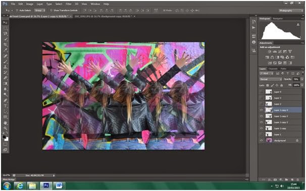
I decided to use this image on the inside of my digipak as it was not suitable for the front cover but it created such a strong feeling I knew I wanted to incorporate it in my digipak. I increased the brightness and the contrast of the image as I wanted to amplify every bit of colour on the page from the graffiti to the blonde in her hair. Gabi is positioned in the center of the image and has her hand in the air as if she's celebrating or she's free. The idea of freedom is very iconic of dance music and I felt this image matches the idea of freedom.

Saturday 21 February 2015
Front Cover of Digipak
I decided that the front cover of my digipak should be a close up of Gabi; as that's what regularly occurs on front covers. I am still sticking to the idea of 'dimensions'.

Initially I thought I would have two different close ups of Gabi and adjust the opacity of the images. After testing it out I realised it did not look that appealing so I resorted to using just one close up.

After deciding that I only wanted to use one image I still needed to decided on how I would position the duplicate images of Gabi. I first had all the images aligned across the horizontal centre and I spaced the images out evenly. I did not like the way it looked as I felt none of the images were clear and it looked too messy.

I continued to rearrange the duplicate images of Gabi's face around the page. I positioned the duplicates at the top left and right hand corners but again I did not like the way it looked. In the end I positioned the duplicates in opposite corners and I really liked the way it looked. The main image was clear and the star was easy to identify while still incorporating the 'dimension' idea. I then added the 'Parental Advisory Explicit Content' logo, added text and adjusted the brightness and contrast of the image.

Second Draft of Digipak Front Cover
I decided to experiment with this image and see how effective it would be as a front cover. I still wanted to keep with my idea of 'dimensions'.

I made a copy of the image and removed the graffiti in the background so I was left with an image of Gabi's body.

I then lowered the opacity of this image so that when it is shown alongside the main image it will be fainter and create the 'dimension' effect.

I added more duplicates and lowered the opacity of the duplicated images depending on how far out it was from the main image of Gabi. The multiple images of Gabi help to amplify the 'dimension' effect.
I then added text to the album cover.

I then repositioned the text to where I thought it looked good. And I added a 'Parental Advisory Explicit Content' logo as well as modifying the brightness and contrast of the image.

This is what I ended up with. I did like my design but after some discussion with my peers I concluded that the page was too busy; with the bright colours and multiple images it was just a lot to look at and not an effective front cover. Furthermore, the image that I used did not show her face which was too unconventional and so I decided that this image will be better on the inside of my digipak rather than on the front cover.
Subscribe to:
Posts (Atom)