
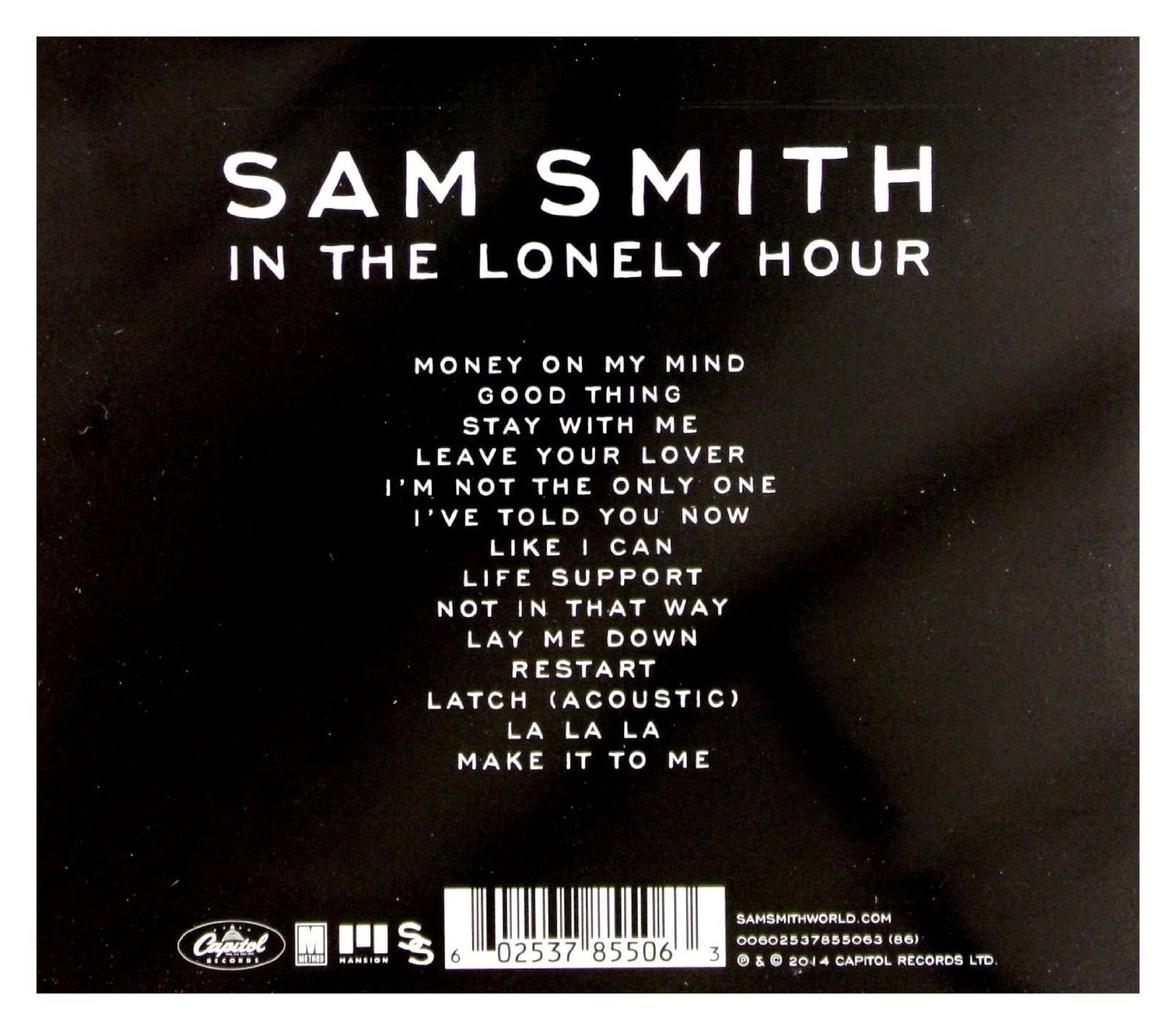
The thing that drew me to Sam Smith's album 'In The Lonely Hour' is the simplicity of it. The use of monochrome colours are nothing to shout about, but because it fits so well with Sam's persona and the way he is as an artist it invites you in. The colours along with the image of Sam Smith create the look of vulnerability which links in to the 'heart-break' themed songs that Sam is so popular for.
The reason why I think this album cover is effective is because it portrays Sam as a real person; it takes away the fame and the fortune that comes with being a singer and strips it down to show Sam at his core; he also tries to replicate this feeling in his music.
Furthermore, the name of the album goes hand in hand with the visuals; 'the lonely hour' connotes the time frame after the end of a relationship. The image shows Sam in deep thought and almost tearful, this again emphasises the idea of vulnerability and the idea he has 'poured his heart out' into this album. He is seen as such a relatable person that this is going to draw people into his music.
Overall, what I have learnt from analysing this album is the impact that colour, imagery and titles have when combined. While Sam's album has a more heartfelt and more romantic theme than my album, it is important for him to be subtle with his use of colour, but as I'm making a deep house album colour is going to be vital; this has helped me understand the difference between what is necessary to create emphasis and when it becomes 'overkill'.
No comments:
Post a Comment