Wednesday, 25 February 2015

Audience Feedback - Rough Cut

In today's lesson we had a rough cut viewing of our music video and our classmates gave us feedback; they identified the parts they liked and noted any areas for improvement.


What I learnt from the feedback:
  • People liked the use of locations.
  • They also thought the performance was good as it was interesting and attention grabbing. 
  • They also liked the editing, especially the quick montage at the beginning and end.
Thing to be improved:
  • There are still a lot of gaps in the video that need footage added to. 
  • There was this one location that people didn't like the costume for as they felt it was too casual compared to the rest of her costumes where she looks more glamorous.
  • Some of the shots were out of sync.
This shows that we need to start moving a bit quicker and start adding more footage into the video. And we need to either re-shoot Gabi on the bridge in another costume or fix those clips when we come to do colourisation.

Monday, 23 February 2015

Final Digipak


 I am very pleased with how my digipak turned out. I think the concept of 'dimensions' is very apparent throughout the digipak and it acts as an effective, recognisable symbol as it is found in the music video and will be incorporated in the website.

Digipak CD Art

My idea for the CD art was influenced by Disclosure's album 'Settle'. They didn't use an image on their CD but incorporated other aspects found on their album. For example, the CD colours match that of the album front cover. 


I wanted my CD art to be simple but maintain it's relevance with the rest of the album. The main colours are black and white which occur repeatedly throughout the album. The pink rim is associated with the pink lipstick found on the front cover. I positioned the 'O' in Tomi over the CD hole to create the idea of 'dimensions' which is a reoccurring theme in the digipak.

Sunday, 22 February 2015

Inside of Digipak

 I decided to use this image on the inside of my digipak as it was not suitable for the front cover but it created such a strong feeling I knew I wanted to incorporate it in my digipak. I increased the brightness and the contrast of the image as I wanted to amplify every bit of colour on the page from the graffiti to the blonde in her hair. Gabi is positioned in the center of the image and has her hand in the air as if she's celebrating or she's free. The idea of freedom is very iconic of dance music and I felt this image matches the idea of freedom. 


Back Cover of Digipak

Saturday, 21 February 2015

Front Cover of Digipak

I decided that the front cover of my digipak should be a close up of Gabi; as that's what regularly occurs on front covers. I am still sticking to the idea of 'dimensions'. 


Initially I thought I would have two different close ups of Gabi and adjust the opacity of the images. After testing it out I realised it did not look that appealing so I resorted to using just one close up. 


After deciding that I only wanted to use one image I still needed to decided on how I would position the duplicate images of Gabi. I first had all the images aligned across the horizontal centre and I spaced the images out evenly. I did not like the way it looked as I felt none of the images were clear and it looked too messy.


I continued to rearrange the duplicate images of Gabi's face around the page. I positioned the duplicates at the top left and right hand corners but again I did not like the way it looked. In the end I positioned the duplicates in opposite corners and I really liked the way it looked. The main image was clear and the star was easy to identify while still incorporating the 'dimension' idea. I then added the 'Parental Advisory Explicit Content' logo, added text and adjusted the brightness and contrast of the image.


Second Draft of Digipak Front Cover

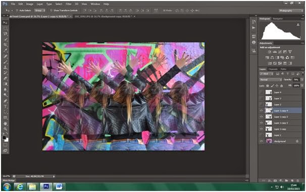
I decided to experiment with this image and see how effective it would be as a front cover. I still wanted to keep with my idea of 'dimensions'.


I made a copy of the image and removed the graffiti in the background so I was left with an image of Gabi's body.


I then lowered the opacity of this image so that when it is shown alongside the main image it will be fainter and create the 'dimension' effect.


I added more duplicates and lowered the opacity of the duplicated images depending on how far out it was from the main image of Gabi. The multiple images of Gabi help to amplify the 'dimension' effect.


I then added text to the album cover.


I then repositioned the text to where I thought it looked good. And I added a 'Parental Advisory Explicit Content' logo as well as modifying the brightness and contrast of the image.


This is what I ended up with. I did like my design but after some discussion with my peers I concluded that the page was too busy; with the bright colours and multiple images it was just a lot to look at and not an effective front cover. Furthermore, the image that I used did not show her face which was too unconventional and so I decided that this image will be better on the inside of my digipak rather than on the front cover.