Showing posts with label Digipak Research. Show all posts

Friday, 20 February 2015

Digipak Research - Eminem


This is by far one of my favourite album covers purely because of the message it illustrates. This was Eminem's come back album after an extensive 5 years of rehab dealing with his drug addition. The album title 'Recovery' is pretty self-explanatory; it describes his battle with his addiction and his recovery and how he made it out the other side. The album title is presented in big bold white letters and a red medical sign  is used to illustrate the letter 'O' this connotes the idea of hospitals and sickness which relates back to his drug addiction.

Furthermore, the image used on the album cover has a very apparent message; it's suggesting he's on the 'road to recovery'. It's such a simple image but it creates such a strong sense of appreciation and power for the audience. The image used on the back of the CD is very representative of Eminem as the sign denotes it's set in Detroit, which is Eminem's home town. This is done to make the audience feel closer to him as it's the idea that he's letting his fans deeper into his life. He's also sat on a sofa with a pensive look on his face, the objects surrounding him look as if they belong in an office or therapy room, which links back to concept of the album being about his rehab and recovery. 

Unlike most albums which include a star name and an album name, Eminem doesn't show his name anywhere on the front cover, this is done to not divert the audiences attention from the message of the album however, Eminem's name is visible on the back cover; this is so the audience knows who's album it is, if they haven't already recognised it as being Eminem's.

The colours used on the CD are very dull, almost earthy and mainly consist of blacks and whites; this is done in order to maintain the simplicity of the album art; so that the concept of the album can be understood without any distraction. Furthermore, the album has a minimal use of colour in order to maintain the seriousness of the subject matter.

This album has taught me a lot about what makes for an effective digipak and it has been very inspirational. I have learnt that having a clear message or concept is key when trying to create particular emotions among your audience. I have also learnt that one powerful image is better than a montage of random ones, so I know that when I'm making my digipak I need to be selective with my images and choose the one with the strongest message. The reason why Eminem gets away with not displaying his name on the front cover is because he has already established an image for himself as an artist and has achieved idol status; furthermore, he doesn't need to exhibit his name because he already has a colossal fan base. My digipak however, would need to have the artist's name at the front cover because she is yet to establish herself as an artist and does not have a big enough fan base. 

Thursday, 19 February 2015

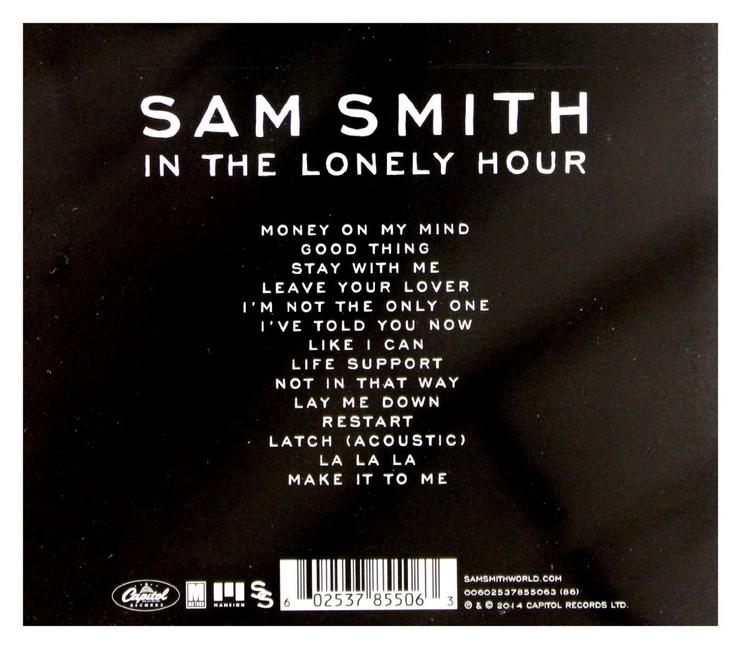
Digipak Research - Sam Smith


The thing that drew me to Sam Smith's album 'In The Lonely Hour' is the simplicity of it. The use of monochrome colours are nothing to shout about, but because it fits so well with Sam's persona and the way he is as an artist it invites you in. The colours along with the image of Sam Smith create the look of vulnerability which links in to the 'heart-break' themed songs that Sam is so popular for.

The reason why I think this album cover is effective is because it portrays Sam as a real person; it takes away the fame and the fortune that comes with being a singer and strips it down to show Sam at his core; he also tries to replicate this feeling in his music.

Furthermore, the name of the album goes hand in hand with the visuals; 'the lonely hour' connotes the time frame after the end of a relationship. The image shows Sam in deep thought and almost tearful, this again emphasises the idea of vulnerability and the idea he has 'poured his heart out' into this album. He is seen as such a relatable person that this is going to draw people into his music.

Overall, what I have learnt from analysing this album is the impact that colour, imagery and titles have when combined. While Sam's album has a more heartfelt and more romantic theme than my album, it is important for him to be subtle with his use of colour, but as I'm making a deep house album colour is going to be vital; this has helped me understand the difference between what is necessary to create emphasis and when it becomes 'overkill'.


Friday, 6 February 2015

Digipak Research - Disclosure


Disclosure are an English electronic music duo. The band consists of the two brother; Guy and Lawrence Howard who's music is of the House genre. What makes disclosure and their album 'Settle' so distinctive are the white lines that are drawn on their faces. This appears on their album cover (as shown above) on all their promotional images and in their music videos. Disclosure have taken this simple concept and created their whole identity. They've become so easily recognisable and so iconic; and this helps to promote their music. 

The idea of simplicity is very apparent on this album cover; they use a simple monochrome font and neutral colours. This is done to make the main feature of the white faces more stark against the almost 'dull' background. Furthermore, the album cover uses an image of two brothers, this is done to promote the idea of 'brotherhood' between the two brothers in Disclosure. 

What I am going to take away from this album cover is the importance of simplicity. It's not about how much you can shove on one page, or how much colour you can fill it with; rather it as about creating an image that is recognisable and iconic, even relatable. I feel in regards to my digipak I will use an image that plays with the idea of 'dimensions' which is also exaggerated in the music video and so will be identifiable if it appears on the digipak too.    


Wednesday, 4 February 2015

Digipak Research - Rihanna


Rihanna has a very strong and apparent star image and one of the ways in which she conveys this is through her album covers. The image of her is at the centre of the album, this is done to draw attention to the album. She is looking down, this could represent shyness, but her facial expression suggests otherwise, the way she has her mouth slightly open is quite seductive. She is almost saying 'I'm an innocent girl with a bed streak', this is also shown in other areas of the digipak. 

The colour red is a main theme used in this digipak from her hair, lipstick and the red roses seen throughout. This has many connotations, the main one being red is known as the colour of 'love', and this is her saying this album is all about love furthermore, the colour red and pink represents the pop genre which is the genre of the album.   

The use of writing is very minimal in this digipak. It includes the artists name and the album name 'LOUD' which is found above and below the image of her, this is done so that nothing obstructs Rihanna's face. The text used is very subtle and a white colour is used, this is done so it stands out against the background. The colour white and the pink rose used as the image on the CD represents pureness, this links back to the the idea of innocence created from the digipak cover. Moreover, the roses also connote romance, love and femininity and this makes it apparent that it is aimed at a female audience. 

This has influenced me to use a central image of my star on my digipak, and it has shown me the importance of colours. I don't have to use lots of different colours, rather I can find one colour with a strong symbol and apply it to different situations.

Wednesday, 8 October 2014

Album Art Research

Album covers just like most other media products have typical codes and conventions which have to be met for it to be effective. Below I have detailed the specific items which must appear on an album.

Front


  • Main image (usually close ups)
  • Title of album
  • Name of artist 
  • A recognisable logo or font that is associated with the artist 

What I have noticed about album covers is they tend to have a central image the artist on the front panel, this is especially true of Pop albums. Solo artists are more likely to have their image at the front as they are trying to promote their music by promoting their appearance. This is done to make the buyer feel like they are close to the artist and allows them to form a deeper connection. The star is made to be the most prominent image with little distractions in background; this is done to emphasise the dominance of the artist and create a stronger star image. This is especially true of female artists who use their sexuality as a selling point to attract male audiences.


Groups and bands are presented slightly differently; while one close up is used of a solo artist the same cannot be done for a group album. Instead they model the group in a variety of heights and poses to create individual images for each member. Some may be standing/sitting/jumping etc. and they will most likely be wearing different items of clothing; this is done to expresses their individuality and allows the audience to identity with one member. While there may be a theme amongst the album e.g. the black clothing on the JLS album or the boom boxes in The Saturdays album, they each have an individual personality that is expressed through their clothing and staging.


However, not all album covers follow the typical conventions. Some artists reject the idea of having their image on the album cover. This could be done for a few reasons; they feel the attention for their album should come from their music and not their appearance. Or it could be they would like their music to be represented by a symbol. These albums tend to be targeted at older audiences of 17-25 as they should be at the level of maturity to not to attracted to something based on its look.


The Arctic Monkeys album cover image is of sound-waves; this follows the genre of their music which is supposed to be alternative/indie; it demonstrates they're not going to be mainstream and use an image of their faces, instead they choose to be represented by that one symbol. Lorde's album cover features her name and album name on a black background. It is a very simple album cover but it has a strong meaning. This is Lorde proclaiming she is only in it for the music, you don't need to like my face or approve of the way I dress, but listen to me sing.


Back


  • Track list 
  • Special Features 
  • Another predominant image

The back of an album usually features a lot of graphics and possibly another predominant image of the artist. The typography usually signifies the genre of the album; special fonts and colours will be used to identify the genre. 


Institutional Information 

  • Price 
  • Barcode
  • Record Label 
  • Year of publishing 
  • Copyright 
  • Individual track writers, composers, engineers, producers 
  • A reference number
  • Band members
  • Guest performers 

Spine


  • Name of artist 
  • Title of album 
  • Record Label 
  • Reference number 

Inserts 

  • Further institutional information for each individual track 
  • Song lyrics 
  • Photographs of artist 
  • Thankyous 


Purpose of an Album Cover

  • To protect the album
  • To advertise the contents 
  • Using the artistic design to reflect the creative intentions of artists
  • To reflect the principles, attitudes etc of Record Label
  • To stand out, to be interesting, to be eye-catching 
  • To boost sales, enhance profit 
  • Attracts on retail shelves 
  • Enables product to be resold through different modes
  • Art becomes the icon