Showing posts with label Analysis. Show all posts

Wednesday, 25 March 2015

Website Research - Ella Eyre


Content:

  • Home Page
  • Updates Page - consists of recent events, performances, single releases
  • My Life Page - consists of images from Ella's Instagram page
  • Watch Page  - has a link to her YouTube/Vevo account. Consists of her music videos, performances, interviews and behind the scenes footage. 
  • Listen - has a link to Soundcloud. Consists of sound files of her songs, covers, interviews and DJ remixes.
  • Shows - consists of her tour dates and performances with links to 'Songkick' which is an online ticket purchasing website.
  • Shop - consists of merchandise that fans can buy
  • Sign-up for free download - fans can sign up and receive a song for free.


Purpose:

'A Pretty Good Website' create and maintain Ella's website but the content is provided by Ella herself (e.g. instagram images) and her record label Virgin EMI Records. As Ella is relatively new on the music scene she is still trying to create a loyal fan base and is still developing her star image; for this reason the record label will aim to include close-ups of Ella wherever possible. This is done to get the viewer more familiar with Ella and increase her recognisability. As Ella is quite young they will use images that portray her in a fun, happy, quirky light but still present her as a normal person. Due to her age, her target audience will be people 14-24 years of age; therefore she will be presented in a way that people can identify with and relate to. As she is yet to receive idol status she won't be presented in the same way as Beyonce per say who is viewed as being greater than human. The key emphasis of this website is promotion, not only of her music, or her merchandise but her face and her star image, as that is what draws the initial attention of the viewer.


Information:

The website is updated daily with new images and videos from Ella's Instagram. But also new videos are added from interviews or from performances. As Ella is a new artist she doesn't have the luxury of maintaining a private life; the way to increasing her fan base is to let them into every aspect of her life; that is why it is really important that her website is up-to-date as the events that happen in her life draw attention to her, that attention is then transferred onto her music. The tour page is also updated as they are released. 


Music:

Her fans have access to all her YouTube videos and any interviews or extra videos she might have, which are all available to view for free. By signing up the fan also gets a free song, this is good incentive to please existing fans and encourages other people to listen to her songs. There is also an array of sound files available on her 'Listen' page, this is important as a potential fan may want to get a better scope of Ella's musical abilities before investing in her album. Unlike other established artists, it is important for Ella to give out some of her music for free as that is the only way people will listen to her music, as no one will pay for a single/album on the off chance they might like it. 


Style:

There are a vast number of images used throughout the website, and a header with an image of her and her is visible on every page, this is done to increase the memorability of the artist. The layout is very modern and has a 'instagram' feel to it. This appeals to a younger generation who are more technologically saavy and so they will feel more comfortable using the website as the layout is so familiar to them. There is a main navigation bar underneath the header; all the links are clearly visible. The main colours used are white and red however, as images take up a large proportion of the website essentially it is filled with many different colours. Pictures aside, the colours used a quite simple and regal which match the 'Royal' script used to display her name. 


Navigation:

Navigating around this website is made very simple due to the navigation bar found underneath the header. It has links to all the relevant pages and the 'Shop' link opens in a new tab so the user can purchase any merchandise and continue browsing the website from where they left off. 

Overall, I think it is a very effective website. It tries to promote Ella from every angle and introduce her as a new artist. I like the use of images as projecting the star image is very important with new artists and I will incorporate this into my ancillary task. I also like the idea of the header, I think it is more engaging than just a name at the top of a screen and so I will also try and incorporate this. 

Tuesday, 24 March 2015

Website Research - Disclosure


Content:
  • Home Page - consists of images, each of which are links to the different sections of the website. This is dependent on the picture for example, the image of the album is a link to the 'Music' page.
  • Blog Page - consists of a timeline of the boys activities that are aided with images.
  • Music Page - consists of the songs that were publicly released that the fans can listen to for free.
  • Photos Page - consists of photos of the Disclosure boys that are either taken of them in their private lives, or photos from performances or promotional photos.
  • Live Page - consists of the different events and venues Diclosure are going to perform in. Also has a link to Ticketmaster so that fans can purchase tickets. 
  • Store Page - consists of merchandise fans can buy ranging from albums to clothing and accessories.
  • Videos Page - consists of videos of the Disclosure boys. That are either music videos, live performances or interviews.
  • There are also links to social media pages such as Facebook, Twitter, YouTube and Instagram.


Purpose:

The purpose of the Disclosure website is to promote them as artists. They only really appeared on the music scene back in 2012 so they are relatively new to the industry and so would not have a huge fan base. The idea of the website is to introduce Disclosure to more people and use incentives such as free music to entice people in. The idea of the Blog and the regular updates is also a good way to maintain fans as it builds the relationship between the fan and the artists. Furthermore, it acts as a platform to increase profits through the availability of merchandise. This also benefits the fans as they can buy items that showcase their love for Disclosure, for example a Tshirt and this brings Disclosure further promotion when other people see the Tshirt. Studio Moross and Robert Maple are in charge of creating and maintaining the website but Disclosures record label Interscope Records are responsible for the content available on the website and for maintaining Dislosures image. 


Information:

There is a variety of information available on the website such as their daily activities, this is presented in the Blog or through images. This allows the fans to feel closer to them and feel respected. Any tours or performances are added to the website as soon as they are confirmed and links to Ticketmaster is also available so that the fans can buy tickets. Furthermore, new music videos or interviews or performances are filmed and put on the website. This is effective because if a fan could't attend a concert they won't feel as if they have missed out because they have the videos. 


Music:

Songs that have been publicly released are available to listen to for free on the website, more songs are also available on the YouTube channel for free. The songs are copyright protected so the audience would not be able to copy or download the songs. But because most of it is available for free it would decrease the chances of it being illegally downloaded. It is important for Disclosure to provide free music because they are new artists; so first they need to get their music out wide, establish their image and have a loyal fan base, only then can they reduce their amount of free content.


Style:

The website uses a simple monochrome theme throughout the website. Due to the fact they are a male duo and their genre of music they are quite restricted in their choice of colour. Saying that however, I think the simplicity of it is incredibly effective and it is very representative of the Disclosure boys. It's very stripped down, no gimmicks and it is all about the music, which resembles the boys characters. 

The layout of the website is also very simple and very easy to navigate. There is a main navigation bar at the top of the page which consists of links to the other pages in the website and their social networking sites. The name 'Disclosure' is visible on every page and if clicked on it will navigate the user to the home page. The website has a very Tumblr/Instagram feel to it as with most modern websites. This is effective as it appeals to their target audience as they are familiar with similar interfaces. 


Navigation:

The website is incredibly easy to navigate as all the link are in one navigation bar that remains in the same place on every page; this allows the user to get more comfortable in using the website. All the links direct the user to the correct pages and there is always a link back to the home page. Links to social networking sites open in a new tab, this is good because once the user has finished looking at the other sites they can close the tab and continue browsing the website.

Overall, I very much like this website. It is very simple but I feel it represents them perfectly; they're not out to sell their looks but simply just to promote their music. I really like the use of boxes that hold the content of each page; I think I might incorporate this into my ancillary product.

Monday, 23 March 2015

Wesbite Research - Beyonce

The first website I decided to analyse was Beyonce's. She is an incredibly popular artist and I was interested to see how she makes her website as effective.


Content:

When the webpage opens the first thing you see is either images or videos.  As you hover over the images/videos writing is revealed that is either titled 'My Life' or 'My Work'. And when you click on one of the images/videos, it lightboxes and the image/video is shown in a larger size and the user has the option of sharing that image/video on their personal social networking sites such as Facebook, Twitter or Pinterest. 
  • Home Page 
  • Album Page - has a list of all her albums and each individual album has a link to the songs, videos, images, credits and documentaries 
  • Song Page - has a track list from all her albums. The viewer can listen to the released songs or buy them.
  • Video Page - has the videos to all her official music videos 
  • DVD Page - has the video from all her tours that can only be purchased 
  • Fragrance Page - has links to all of her fragrances
  • Shop Page - links to all her merchandise 
  • #Beygood Page - links to all her charitable work and all the organisations she supports 


Purpose:

Beyonce's record label are Columbia Records and they are responsible for maintaining her website. While Beyonce may provide some of the images or videos it is the record label's job to make it available on the website. I think the main thing they tried to achieve with this website (especially though the function of the home page) is to make the viewer feel closer to Beyonce; this is done through the use of images and videos that display her private life; which is something Beyonce has been very secretive about it in the past. Other parts of the website focus on promoting Beyonce's music through the use of YouTube clips or sound clips. They also focus on increasing sales through the use of the merchandise; this allows fans to buy items to showcase their love for Beyonce or even buy items to add to collections e.g. albums. However, due to the fact Beyonce is now a mature artist and her music has been around for over a decade her website becomes more natural. She is already an established artist so it's no longer about trying to create an image or create a fan base; it's about giving her existing fan base more ways to know her. This is done through the use of documentaries where Beyonce comments on her thoughts and feelings while creating her numerous studio albums.


Information:

The website is updated daily with the new images or videos that Beyonce shares on her Instagram page. The images also allow the viewer to know where in Beyonce is and what she is doing. Any new albums/singles/perfumes/merchandise are updated as soon as they are publicly released. The website does not however have a 'Tour' page; as soon as she decides to do a tour the page will become live on the website. 


Music:

All the singles that have been released individually are available to listen for free on the website but the singles that weren't released individually have to be purchased, this is so that the artist can make a profit. However, the album is available to listen for free on YouTube. 


Style:

The style of the website is very much symbolic of Beyonce as an artist and a person. It captures her elegance and her simplicity through the use of a black and white layout; this expresses her maturity as an artist and as a person e.g. her being a mother. However, it doesn't really fit with the 'Pop' genre as you would expect to see a more vibrant use of colour. The layout of the website makes it modern and edgy, this is done through the use of the Instagram style home page; so while the website maintains it's elegance it is still fun enough to appeal to a slightly younger audience. 


Navigation:

The navigation on this website is relatively simple. There is a tab on the left hand side of the page; when clicked it opens up bigger on the screen and gives the user options for pages to navigate to. Once the user has looked through the pages and decided they want to return to the home page they click on Beyonce's name that is visible at the top of every page. Any links are opened in another tab so that once the user has finished viewing that page they can simply close the tab and go back to browsing the website. 

I really like this website for it's elegance and simplicity. I think the basic use of colours is very effective for the type of artist Beyonce is and for the level of her success. This website has taught me that simplicity is important however, because I am making a website for a new artist it cannot be as simple as this one; I have to offer more in order to attract an audience. I also like the idea of a navigation tab instead of a bar but I will see what is more common on other websites before deciding on what to use in my own.

Friday, 13 March 2015

Website Research

Before starting work on my second ancillary task it was important that I conduct some research into popular existing websites so that I can make a website that is just as effective and engaging. There are different components to a website; each of which has a specific task, which can either be to inform the viewer or to entertain them. Shown below are the series of conventions that a website must follow for it to be successful.


Friday, 20 February 2015

Digipak Research - Eminem


This is by far one of my favourite album covers purely because of the message it illustrates. This was Eminem's come back album after an extensive 5 years of rehab dealing with his drug addition. The album title 'Recovery' is pretty self-explanatory; it describes his battle with his addiction and his recovery and how he made it out the other side. The album title is presented in big bold white letters and a red medical sign  is used to illustrate the letter 'O' this connotes the idea of hospitals and sickness which relates back to his drug addiction.

Furthermore, the image used on the album cover has a very apparent message; it's suggesting he's on the 'road to recovery'. It's such a simple image but it creates such a strong sense of appreciation and power for the audience. The image used on the back of the CD is very representative of Eminem as the sign denotes it's set in Detroit, which is Eminem's home town. This is done to make the audience feel closer to him as it's the idea that he's letting his fans deeper into his life. He's also sat on a sofa with a pensive look on his face, the objects surrounding him look as if they belong in an office or therapy room, which links back to concept of the album being about his rehab and recovery. 

Unlike most albums which include a star name and an album name, Eminem doesn't show his name anywhere on the front cover, this is done to not divert the audiences attention from the message of the album however, Eminem's name is visible on the back cover; this is so the audience knows who's album it is, if they haven't already recognised it as being Eminem's.

The colours used on the CD are very dull, almost earthy and mainly consist of blacks and whites; this is done in order to maintain the simplicity of the album art; so that the concept of the album can be understood without any distraction. Furthermore, the album has a minimal use of colour in order to maintain the seriousness of the subject matter.

This album has taught me a lot about what makes for an effective digipak and it has been very inspirational. I have learnt that having a clear message or concept is key when trying to create particular emotions among your audience. I have also learnt that one powerful image is better than a montage of random ones, so I know that when I'm making my digipak I need to be selective with my images and choose the one with the strongest message. The reason why Eminem gets away with not displaying his name on the front cover is because he has already established an image for himself as an artist and has achieved idol status; furthermore, he doesn't need to exhibit his name because he already has a colossal fan base. My digipak however, would need to have the artist's name at the front cover because she is yet to establish herself as an artist and does not have a big enough fan base. 

Thursday, 19 February 2015

Digipak Research - Sam Smith


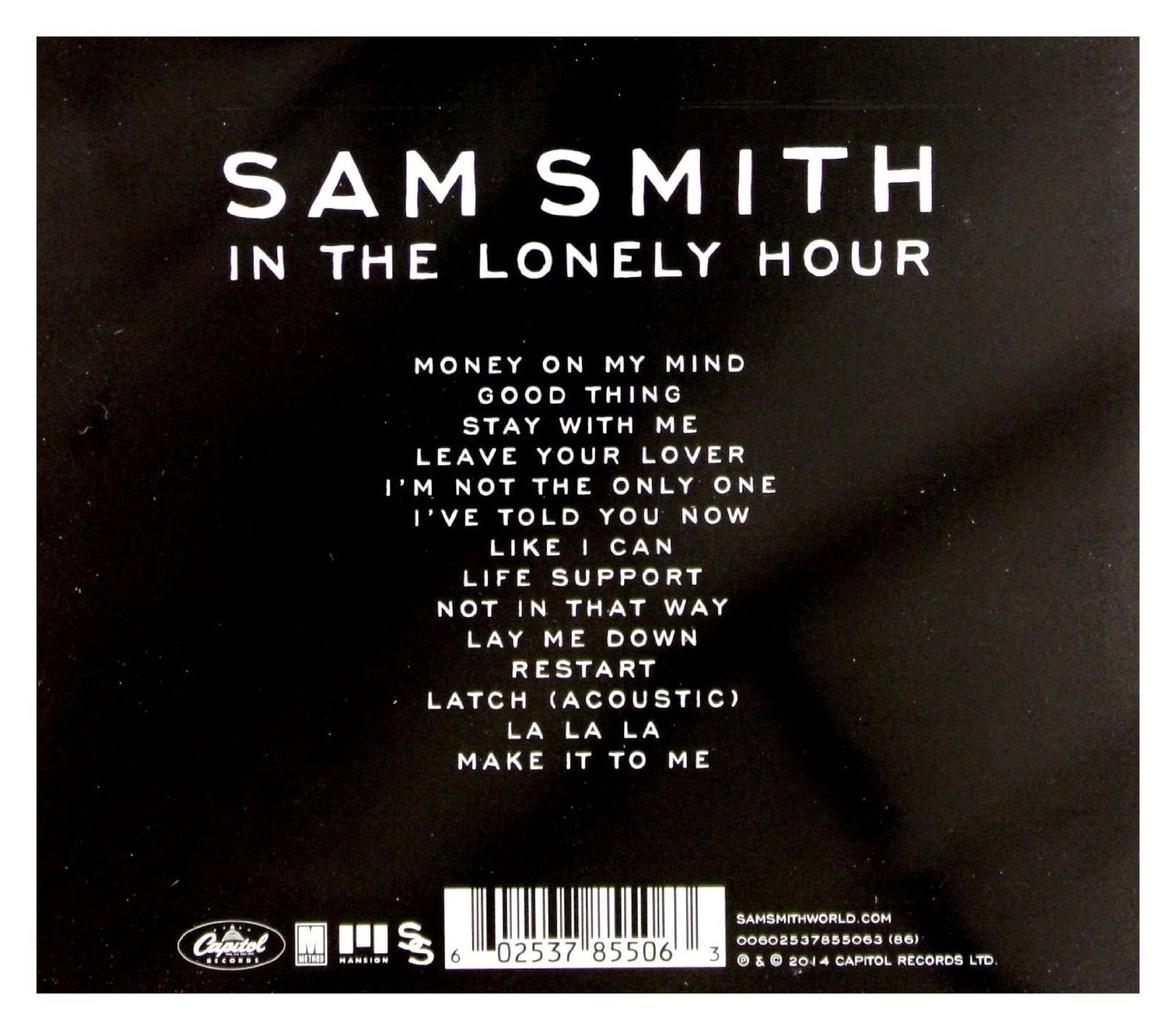
The thing that drew me to Sam Smith's album 'In The Lonely Hour' is the simplicity of it. The use of monochrome colours are nothing to shout about, but because it fits so well with Sam's persona and the way he is as an artist it invites you in. The colours along with the image of Sam Smith create the look of vulnerability which links in to the 'heart-break' themed songs that Sam is so popular for.

The reason why I think this album cover is effective is because it portrays Sam as a real person; it takes away the fame and the fortune that comes with being a singer and strips it down to show Sam at his core; he also tries to replicate this feeling in his music.

Furthermore, the name of the album goes hand in hand with the visuals; 'the lonely hour' connotes the time frame after the end of a relationship. The image shows Sam in deep thought and almost tearful, this again emphasises the idea of vulnerability and the idea he has 'poured his heart out' into this album. He is seen as such a relatable person that this is going to draw people into his music.

Overall, what I have learnt from analysing this album is the impact that colour, imagery and titles have when combined. While Sam's album has a more heartfelt and more romantic theme than my album, it is important for him to be subtle with his use of colour, but as I'm making a deep house album colour is going to be vital; this has helped me understand the difference between what is necessary to create emphasis and when it becomes 'overkill'.


Friday, 6 February 2015

Digipak Research - Disclosure


Disclosure are an English electronic music duo. The band consists of the two brother; Guy and Lawrence Howard who's music is of the House genre. What makes disclosure and their album 'Settle' so distinctive are the white lines that are drawn on their faces. This appears on their album cover (as shown above) on all their promotional images and in their music videos. Disclosure have taken this simple concept and created their whole identity. They've become so easily recognisable and so iconic; and this helps to promote their music. 

The idea of simplicity is very apparent on this album cover; they use a simple monochrome font and neutral colours. This is done to make the main feature of the white faces more stark against the almost 'dull' background. Furthermore, the album cover uses an image of two brothers, this is done to promote the idea of 'brotherhood' between the two brothers in Disclosure. 

What I am going to take away from this album cover is the importance of simplicity. It's not about how much you can shove on one page, or how much colour you can fill it with; rather it as about creating an image that is recognisable and iconic, even relatable. I feel in regards to my digipak I will use an image that plays with the idea of 'dimensions' which is also exaggerated in the music video and so will be identifiable if it appears on the digipak too.    


Wednesday, 4 February 2015

Digipak Research - Rihanna


Rihanna has a very strong and apparent star image and one of the ways in which she conveys this is through her album covers. The image of her is at the centre of the album, this is done to draw attention to the album. She is looking down, this could represent shyness, but her facial expression suggests otherwise, the way she has her mouth slightly open is quite seductive. She is almost saying 'I'm an innocent girl with a bed streak', this is also shown in other areas of the digipak. 

The colour red is a main theme used in this digipak from her hair, lipstick and the red roses seen throughout. This has many connotations, the main one being red is known as the colour of 'love', and this is her saying this album is all about love furthermore, the colour red and pink represents the pop genre which is the genre of the album.   

The use of writing is very minimal in this digipak. It includes the artists name and the album name 'LOUD' which is found above and below the image of her, this is done so that nothing obstructs Rihanna's face. The text used is very subtle and a white colour is used, this is done so it stands out against the background. The colour white and the pink rose used as the image on the CD represents pureness, this links back to the the idea of innocence created from the digipak cover. Moreover, the roses also connote romance, love and femininity and this makes it apparent that it is aimed at a female audience. 

This has influenced me to use a central image of my star on my digipak, and it has shown me the importance of colours. I don't have to use lots of different colours, rather I can find one colour with a strong symbol and apply it to different situations.

Conventions of a Digipak

Digipaks are used as a promotional tool by record companies to increase the awareness of a new artist or as a collectible item for a popular artist. Digipaks consist of a front cover, back cover, spine, inside CD tray, CD as well as some form of text/image pages that either fold out or is in booklet form.
Below are possible templates for digipaks.


What is used on a digipak:
Front Cover: This usually consists of a dominant image of the star, along with the name of the album and the name of the star. The front cover often features something that is easily recognisable, that could either be representative of the artist or representative of the genre of music.

Back Cover: This contains the track list for that album, the name and logo of the record company, any awards or quotes from magazines or newspapers, copyright information a barcode, artist website information, links to social networking sites etc. 

Spine: This mostly has the name of the album or artist, sometimes even both.

Taylor Swifts digipak for the album 'RED'.
The digipak for 'RED' follows the typical conventions of a digipak. The front cover has an very prominent image of Taylor Swift, who is wearing her iconic red lipstick that is she well know for, as she wears it in all her videos and appearances, this emphasizes the artist brand image which can increase the popularity of the artist. Both the title and name of the star are made very apparent on the cover, this is done for marketing purposes. Inside is the CD and a booklet that contains the lyrics to the songs featured on the album as well as other images of Taylor. Everything about this digipak makes it apparent that Taylor is a pop artist. This is done through the use of images; Taylor is portrayed in an innocent light, it's subtle yet striking enough to catch your attention. The mainstream clothing worn by Taylor is also an indication of the pop genre.  

Thursday, 11 December 2014

Music Video Research: Blonde - I Loved You (feat. Melissa Steel)


The concept of this music video is about the friendship between two girls who live as if their bond is unbreakable, and before you know it life gets in the way and rips that bond apart. While the concept may not have a direct link with the genre of Dance/Deep House the mise en scene does. For instance the location that this music video is set in promotes a very 'urban', 'gritty' atmosphere. This is done through the use of graffiti and run-down buildings. The clothes worn in this music video are conventional of this genre of music.


The main pieces of clothing worn throughout the video are either denim or leather, this is significant as it is the type of clothing that people wear when they go clubbing or dancing and this creates links to the song being a 'dance' song. There is evidence of sexual interaction and alcohol use in this video, and this is linked to the idea of stereotypical behaviours seen at clubs, and the music video draws on it to confirm it's relationship with dance music.


The lighting used in the video is quite bleak, it's not very bright but it's also not too dark. This is done to emphasise the gritty scenery. The mise en scene also signifies a run down neighbourhood, which exaggerates the 'urban' feel to the music video as that particular image has become a trademark for urban video, which is further amplified by the graffiti.
 

Friday, 5 December 2014

Music Video Research:Sigma ft. Paloma Faith - Changing


The music video for 'Changing' features elements you would expect to see in a video of the dance genre. An example of this is the use of urban locations, which promotes a 'gritty' feel to the video; the use of graffiti also helps to build on this theme. As an artist Paloma has a very dominant 'Star Image' which is utilised extensively in this video. She has this loud, fun and energetic persona that is fit for the dance genre. The idea of movement (travelling) is the concept used in this video, as we see Paloma travelling around in a 1950s Cadillac which is a further signifier of the dance genre. 


The video also includes a lot of different locations and has a vibrant use of neon colours which signifies the stereotypical club scene and thus links in with the genre of the song. Furthermore, the bright colours seen throughout the video further develops its relationship with the genre as the colours used in the clothing and found in the background can connote strobe lighting used at clubs. The dancing, the colours and the main star all combined create this fun, free and youthful atmosphere, that is representative of the core ideals of dance music.


Tuesday, 25 November 2014

Music Video Research:Wilkinson - Afterglow


The video for Afterglow is by far one of my favourites because of the ingenuity and originality of the visuals. The concept of the video revolves around a couple, and describes all their time together using objects or metaphors. An example of this is how they used clocks to illustrate the minutes they spent together. 


This music video didn't stick to the typical conventions of a dance track. There is no apparent 'star' to attract viewers; but it is compensated by the engaging narrative. The video gains its appeal and likeability through its comedic value, as well as through the audiences being able to identify with the couple. The music video draws on the idea of a sexual relationship, this is done through the use of sexual equipment and metaphors/innuendos. This is an example of how the video does incorporate elements which are typical of the dance genre. The typical target audience for this music video is 15-26 year old's, who are part of a mainstream culture. 

Friday, 21 November 2014

Target Audience

In order for a product to be successful it must be aimed at a specific audience, know as the target audience. This specific group of people are responsible for generating profit; and the success of a product is based on how it attracts these audiences.

The target audience for my music video is 15-25 year olds. The sexual nature of the song makes it inappropriate for younger audiences and immature for people over 25. Besides the fact the song is incredibly sexual; at its core it is still a dance song which makes it very appealing for this age group, as the ages 15-25 are considered as the time have fun and dance and be free; which is the message given from any dance anthem. This song will also be appropriate for people in their late teens as they'll most likely be at university and dancing and clubbing will very much become a huge part of their lives. 


Furthermore, while this song may be sexual I aim to approach it from a different angle. Because there is a chance that we may appeal to a younger audience, the video will not promote drugs or alcohol like other dance music videos do. The visuals will be toned down so that they are not over sexual and any innuendos or suggestions will be presented in a way that only older audiences will be able to pick up on.


While my chosen song 'Gecko' is of the Deep House genre which has a specific audience; it's popularity in the mainstream chart suggests that our target audience is from a more younger but slightly sophisticated demography. The psychographic of our audience will be explorers, because they want to have fun and seek discovery. But the explicit nature of dance songs in general suggest that the psychographic of our typical audience will be struggler's who seek escape but find it in drugs and alcohol.

Below is an image which illustrates what our target audience may look like.


Thursday, 20 November 2014

Deep House

The song we choose for our music video is Gecko (Overdrive) and it comes under the deep house genre. Deep house is a subgenre of house music; it originated in the 1980s and it has heavy influences from Chicago house and jazz funk. Deep house is known for its use of complex melodies and soul, ambient vocals (if there is any).


Examples of deep house songs are:
Gorgon City - Ready For Your Love ft. MNEK


Route 94 - My Love ft. Jess Glynne


Tove Lo - Habits (Stay High)


Shift K3Y- Touch


Thursday, 16 October 2014

Intertextuality

Intertextuality refers to the idea of drawing upon existing texts in order to spark recognition in the audience. Pleasure is derived by those who understand the reference and somehow feel flattered by this.

There are many examples of intertextuality in the video for 'The Monster' by Eminem ft. Rihanna. This video tells the story of Eminem's music career, it uses clips from his most iconic and popular songs to create a montage, describing his struggle with drugs and alcohol and all the commotion that entered his life when his career took off. His music is known for being controversial, gleefully violent and hilarious, this leaves him with the task to create music videos to match just that. There are visual references to 'My Name Is', 'Lose Yourself', 'The Way I Am' and possibly the most iconic moment of his career when he performed 'Stan' with Elton John at the Grammy Awards in 2001.


This image is from the video for 'My Name Is'.


Original Song


The Monster


This image is from the video for 'Lose Yourself'.


Original Song


The Monster


This is the video for 'The Way I Am'.


Original Song


The Monster

Monday, 13 October 2014

Voyeurism - The Female Gaze

Voyeurism is the idea of viewing in order to gain sexual gratification through observing nude bodies or through sexual acts. Voyeurism is most commonly found in music videos , and largely consists of women being objectified in order to attract the male gaze. This is done through the use of low angles, close ups, fragmented body shots, editing and costumes.

We as consumers are very used to seeing the typical images of women being objectified, so it is very uncommon to see males being objectified for the sexual gain of women. A good example of the female gaze and voyeurism is; Jennifer Lopez I Luh Ya Papi ft French Montana.


 The video begins with J-Lo sitting in a room surrounded by half-naked men. The camera slowly pans over one of the men, and immediately it is clear this video is meant for female viewing as it objectifies men.


In this next picture you see her putting on a lot of big gold chains, and then dancing around a lot of very expensive cars. This is the sort of behaviour you would expect to see from a male in a music video. She has completely inverted the image of conventional gender roles in the music video.


Throughout the course of the video we see a lot of shots of men's bodys, including close ups on abs and crotch shots. It also tends to be in slow motion to add greater emphasis on the physique but also for the purpose of having the image linger in the mind of the viewer for longer.


The shot where Jennifer is standing at the front of the pool and the men are all lined up against the side of the pool, gives the impression she is in control and the men are nothing but mere decoration.


Jennifer continues to toy with the men further on in the video. In this shot she and her friends are seen slapping a mans bum and pouring stuff down his pants. His face is not shown just his body. He is made to look more like an object and less like a person. This reflects the action seen in other videos where men are seen slapping women's buts.