Monday, 23 February 2015

Final Digipak


 I am very pleased with how my digipak turned out. I think the concept of 'dimensions' is very apparent throughout the digipak and it acts as an effective, recognisable symbol as it is found in the music video and will be incorporated in the website.

Digipak CD Art

My idea for the CD art was influenced by Disclosure's album 'Settle'. They didn't use an image on their CD but incorporated other aspects found on their album. For example, the CD colours match that of the album front cover. 


I wanted my CD art to be simple but maintain it's relevance with the rest of the album. The main colours are black and white which occur repeatedly throughout the album. The pink rim is associated with the pink lipstick found on the front cover. I positioned the 'O' in Tomi over the CD hole to create the idea of 'dimensions' which is a reoccurring theme in the digipak.

Sunday, 22 February 2015

Inside of Digipak

 I decided to use this image on the inside of my digipak as it was not suitable for the front cover but it created such a strong feeling I knew I wanted to incorporate it in my digipak. I increased the brightness and the contrast of the image as I wanted to amplify every bit of colour on the page from the graffiti to the blonde in her hair. Gabi is positioned in the center of the image and has her hand in the air as if she's celebrating or she's free. The idea of freedom is very iconic of dance music and I felt this image matches the idea of freedom. 


Back Cover of Digipak

Saturday, 21 February 2015

Front Cover of Digipak

I decided that the front cover of my digipak should be a close up of Gabi; as that's what regularly occurs on front covers. I am still sticking to the idea of 'dimensions'. 


Initially I thought I would have two different close ups of Gabi and adjust the opacity of the images. After testing it out I realised it did not look that appealing so I resorted to using just one close up. 


After deciding that I only wanted to use one image I still needed to decided on how I would position the duplicate images of Gabi. I first had all the images aligned across the horizontal centre and I spaced the images out evenly. I did not like the way it looked as I felt none of the images were clear and it looked too messy.


I continued to rearrange the duplicate images of Gabi's face around the page. I positioned the duplicates at the top left and right hand corners but again I did not like the way it looked. In the end I positioned the duplicates in opposite corners and I really liked the way it looked. The main image was clear and the star was easy to identify while still incorporating the 'dimension' idea. I then added the 'Parental Advisory Explicit Content' logo, added text and adjusted the brightness and contrast of the image.


Second Draft of Digipak Front Cover

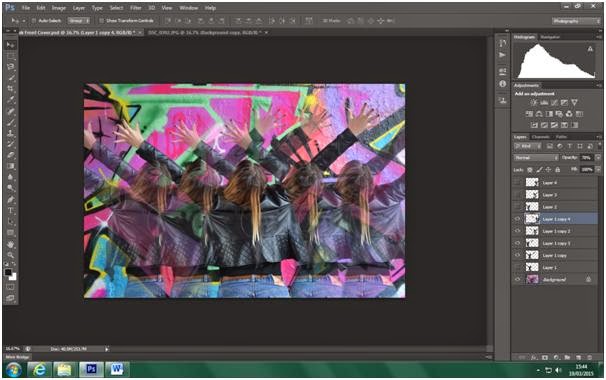
I decided to experiment with this image and see how effective it would be as a front cover. I still wanted to keep with my idea of 'dimensions'.


I made a copy of the image and removed the graffiti in the background so I was left with an image of Gabi's body.


I then lowered the opacity of this image so that when it is shown alongside the main image it will be fainter and create the 'dimension' effect.


I added more duplicates and lowered the opacity of the duplicated images depending on how far out it was from the main image of Gabi. The multiple images of Gabi help to amplify the 'dimension' effect.


I then added text to the album cover.


I then repositioned the text to where I thought it looked good. And I added a 'Parental Advisory Explicit Content' logo as well as modifying the brightness and contrast of the image.


This is what I ended up with. I did like my design but after some discussion with my peers I concluded that the page was too busy; with the bright colours and multiple images it was just a lot to look at and not an effective front cover. Furthermore, the image that I used did not show her face which was too unconventional and so I decided that this image will be better on the inside of my digipak rather than on the front cover.

Friday, 20 February 2015

Digipak Research - Eminem


This is by far one of my favourite album covers purely because of the message it illustrates. This was Eminem's come back album after an extensive 5 years of rehab dealing with his drug addition. The album title 'Recovery' is pretty self-explanatory; it describes his battle with his addiction and his recovery and how he made it out the other side. The album title is presented in big bold white letters and a red medical sign  is used to illustrate the letter 'O' this connotes the idea of hospitals and sickness which relates back to his drug addiction.

Furthermore, the image used on the album cover has a very apparent message; it's suggesting he's on the 'road to recovery'. It's such a simple image but it creates such a strong sense of appreciation and power for the audience. The image used on the back of the CD is very representative of Eminem as the sign denotes it's set in Detroit, which is Eminem's home town. This is done to make the audience feel closer to him as it's the idea that he's letting his fans deeper into his life. He's also sat on a sofa with a pensive look on his face, the objects surrounding him look as if they belong in an office or therapy room, which links back to concept of the album being about his rehab and recovery. 

Unlike most albums which include a star name and an album name, Eminem doesn't show his name anywhere on the front cover, this is done to not divert the audiences attention from the message of the album however, Eminem's name is visible on the back cover; this is so the audience knows who's album it is, if they haven't already recognised it as being Eminem's.

The colours used on the CD are very dull, almost earthy and mainly consist of blacks and whites; this is done in order to maintain the simplicity of the album art; so that the concept of the album can be understood without any distraction. Furthermore, the album has a minimal use of colour in order to maintain the seriousness of the subject matter.

This album has taught me a lot about what makes for an effective digipak and it has been very inspirational. I have learnt that having a clear message or concept is key when trying to create particular emotions among your audience. I have also learnt that one powerful image is better than a montage of random ones, so I know that when I'm making my digipak I need to be selective with my images and choose the one with the strongest message. The reason why Eminem gets away with not displaying his name on the front cover is because he has already established an image for himself as an artist and has achieved idol status; furthermore, he doesn't need to exhibit his name because he already has a colossal fan base. My digipak however, would need to have the artist's name at the front cover because she is yet to establish herself as an artist and does not have a big enough fan base.